What makes a good presentation?
Here’s the (deceptively) simple recipe
I think we all know a good presentation when we see one. Maybe it informs us of something we needed to know, or convinces us to change our minds about something we had previously been for or against, or it compels us to take action on an important initiative. Maybe it’s simply entertaining enough that it engages us to learn.
A good presentation, delivered well, can do all of these things and more. But how do you create one?
The formula is deceptively simple, like Carl Sagan’s recipe for apple pie:
“If you wish to make an apple pie from scratch, you must first invent the universe.”
Don’t worry, creating a powerful presentation is less difficult than creating a universe. Still, it’s no cakewalk. We’ve outlined the elements of a presentation before. They are:
-
Research
-
Storytelling
-
Design
You won’t have any trouble finding other recipes or approaches or advice on good presentation design, but here’s our take on why the most critical differentiator is to wrap that research, storytelling, and design in a visual narrative.
Make your point with visual storytelling
Quality visual storytelling generates better results. On the surface, visuals are eye-catching and capture your audience’s attention. Experiment a little and you’ll start to see how visuals help share your business’ message in an easy, engaging, digestible way. But the real benefit is how a narrative based on visuals help you (and your brand, in the long run) connect to audiences on a deeper level.
Here’s a list of potential visuals:
-
Animated videos — In the world of video animation, explainer videos are among the most powerful, highly searched, and compelling formats
-
Infographics — Infographics and visual storytelling simplify complex messages by combining words, visuals, and data into easy-to-understand graphical presentations that help people learn information faster and retain that information longer than if they’d received it by other means
-
Charts and graphs — Data is information. But sometimes, in order to get from info to insight, it needs design help in the form of charts, graphs, and other visuals that showcase meaningful ideas, patterns, and correlations
-
Illustrations & iconography — Custom illustrations, vignettes, and icons can transform any thing (or idea) into a reality that everyone can see
-
Photos — You can use your own images, license photos from a stock site, or hire a professional photographer
-
Memes & GIFs — Memes resonate with so many people because they often put an unexpected twist on something common or already known, and GIFs capture a funny or relevant moment in time, and connect your story to pop culture
-
Clip art
Here’s the caveat: you’ve got to make sure you’re integrating meaningful, quality visual media that contributes to the storytelling—not just visuals for the sake of visuals. A story with meaningless art fluff is distracting and amateurish. Clip art is almost always meaningless fluff. And searching Google Images gives you typical, token visual results (and leads to copyright issues). So striking clip art from the list of options is not a joke.
Research shows that people only remember about 10% of the information that they’ve been presented when they read or hear it. But add an image and the amount they remember increases to 65%.
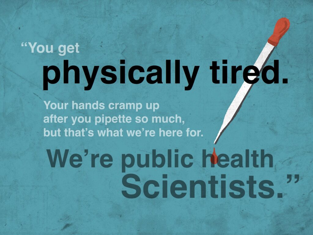
Let’s look at one of the several plenary decks we’ve created for the Association of Public Health Laboratories. The APHL represents governmental laboratories that monitor and detect public health threats. Every year Executive Director Scott Becker speaks on a big health issue and this session addressed the global response to rebuild the laboratory system post-Ebola in Sierra Leone, as well as specific actions to mount an effective response to Zika virus in the United States. Using visual thinking, we conceptualized and illustrated custom artwork to bring those ideas to life in an engaging and highly visual presentation—taking APHL’s powerful story well beyond bullet points.
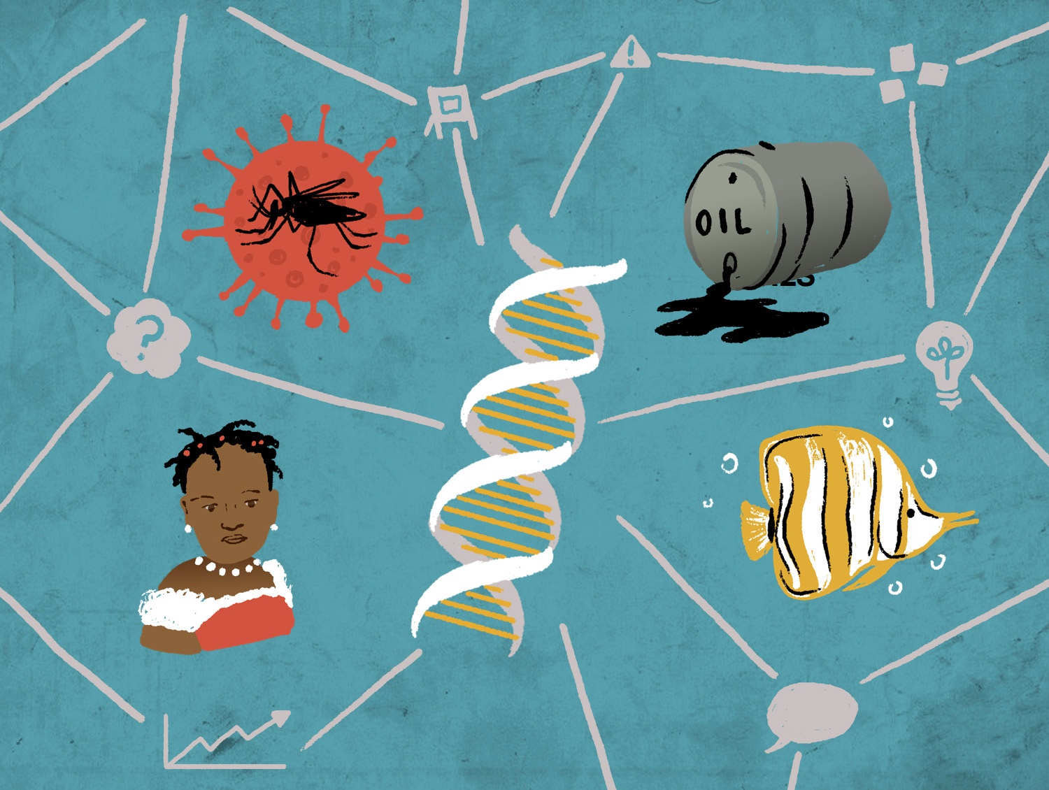
Unfortunately, we can’t share the entire presentation deck—but the main point is that the audience learned about both terrible dangers and incredible accomplishments, via a highly visual deck that made global issues both real and relevant to everyone in the room.
“The most effective presenters use the same techniques as great storytellers: By reminding people of the status quo and then revealing the path to a better way, they set up a conflict that needs to be resolved.” —Nancy Duarte
And the APHL visuals aren’t just playful cartoons or sterile charts. The artwork we created for this keynote is soulful, graphic, and compelling—it helps people connect to the content. This is because APHL, their writing partner, and our team collaborated to craft a presentation based on an understanding not just of the story and the goals, but of the audience.
Improve your business with compelling data
When we say something like “sterile charts”, it’s not to denigrate the idea of charts and graphs—it’s to emphasize that visuals must be fit-for-purpose based on your information and your audience. When done properly, appropriate visuals can increase engagement by 120-180%, and increase the desire to read content by 80%.
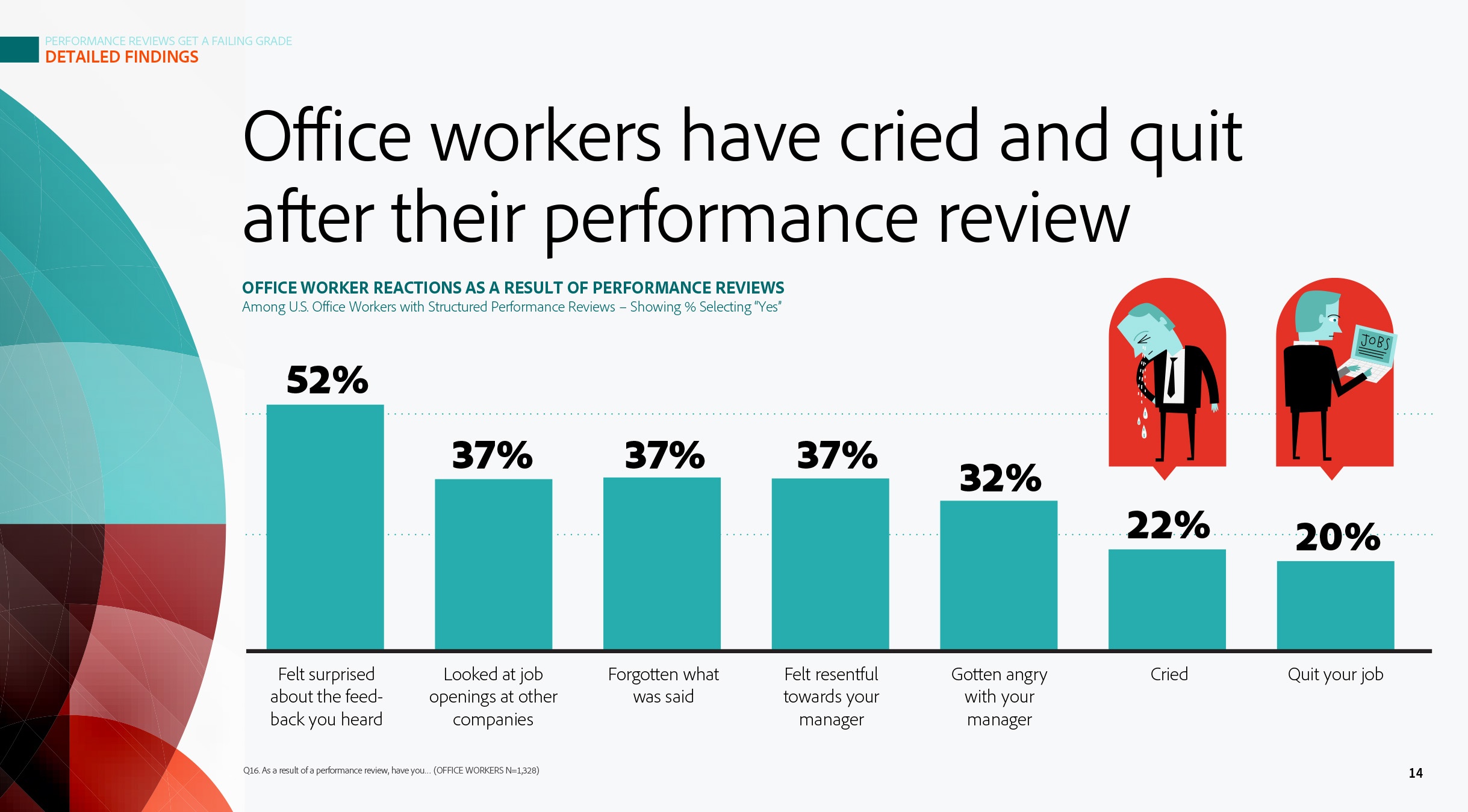
Depending on the content, some presentation charts should be plain and straightforward, and some deserve a layer of visual storytelling—as long as it doesn’t affect the integrity of the data. When Adobe completed a huge research project in collaboration with Golin, they wanted to put out a report that injected feeling into the story. The findings made it obvious that there are some pretty emotional reactions to things like performance reviews, and our creative presentation brought that to life.
Other customers or topics require a less illustrative approach. Presentation themes can, and should, of course, vary. It’s all about determining what makes an effective presentation based on the circumstances.
Perfect your deck with strong design
The effectiveness of visual media is proven. 65% of people are visual learners. So remember this: the overall slide design is just as important as your voiceover and your visuals.
Anyone can use PowerPoint, Google Slides, or Keynote presentation software to create a deck. If you’re the DIY type, look into and learn about some basic design principles like the rules of thirds, hierarchy, symmetry, and typography. One of the best books to help new designers (and remind the more experienced) is the shockingly long-titled Universal Principles of Design, Revised and Updated: 125 Ways to Enhance Usability, Influence Perception, Increase Appeal, Make Better Design Decisions, and Teach through Design by William Lidwell. Also be sure to check out Cliff Atkinson’s and Nancy Duarte’s thoughtful work.
Using design to weave your story into a well-made presentation—based around meaningful visuals rather than repetitive bullet points—gives you a competitive advantage in sales and marketing, internal change communications, VC pitches, or even your upcoming TED Talk 😉
Just know this: good visuals won’t save a bad story. Write and rewrite, edit, revise, get feedback, practice your presentation. Or, work with a company like Tremendousness that is happy to do all of the above. Except the practice part—that’s on you.
Now what?
Start researching, working out your story, designing! Or make it easy on yourself and learn more about our presentation solutions (and everything else we do) and get in touch with Tremendousness today.