The Tremendous 10 link roundup, #79
- The Surprising History of the Infographic | “Early iterations saved soldiers’ lives, debunked myths about slavery and helped Americans settle the frontier.”
- Good Charts: The Book I Wish I’d Written | “It isn’t often that a book comes out and I say “I wish I’d written that book.” But if I could have double-clicked on the data section of slide:ology and had a book pop out, Good Charts would be the book! It’s a remarkable trek through how data should be explored and displayed—and not just for data scientists and designers, but for everyone. The book’s author Scott Berinato argues that data visualization will soon become an essential workplace skill and that those who learn how to do it well will be the ones who get noticed and contribute to their companies’ success.”
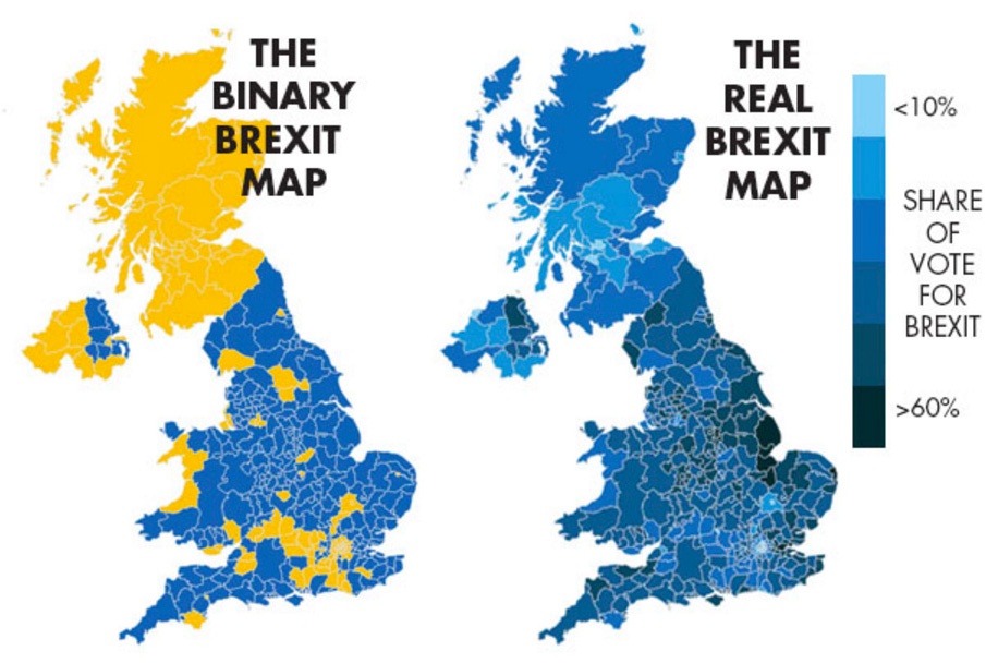
- Diverging color schemes: Showing good data isn’t enough; you need to show it well | “Fraser Nelson, editor of The Spectator, claims that his map of Brexit is better than a diverging color scheme one… I beg to disagree. Nelson’s map is misleading and far from being “real”, although it does show accurate data. This is yet another example of how to build a dubious visualization using legitimate numbers.”
- The Evolution of Pixar | “Finding Dory is almost here, and to celebrate, here is over 30 years of Pixar animation. To infinity and beyond!”
- Apple doesn’t understand photography | “The most innovative thing Apple did with their Photo app recently was the addition of a ‘Selfie’ filter. You can find the folder in your Photos app, and yeah, it is filled with Selfies. Apart from that Apple still thinks we use photography as we did it 30 years ago: we go on a trip, take a bunch of photo’s then struggle with how to show our friends these photos when we get back from our trip. Well, I’ve got news for you Apple; that’s maybe 1% of photography, and not really an issue most of us deal with.”
- A top audio engineer explains NPR’s signature sound | “What makes NPR’s broadcast sound so crisp and bright, while many local public radio stations have a bassier, boomier tone? Adam Ragusea, host of our podcast The Pub, wanted to find out, so he recently interviewed the guy who should know best — Shawn Fox, senior director of audio engineering at NPR.”
- Typography for User Interfaces | “Since my early days in the industry, I’ve grown to love type and all the little nuances that go into setting it. In this article, I want to share some of the fundamentals that I’ve learned, and hopefully help you get better at setting type for user interfaces.”
- A Single Div | “A CSS drawing project by Lynn Fisher.”
- Book Rainbow | “Jonathan Whitfill is the force behind this book rainbow. Really wonderful. Made me look.”
- Blackbird | “The Mill transforms automotive advertising with The BLACKBIRD® – the first fully adjustable car rig that creates photoreal CG cars.”
Image: maps by Fraser Nelson/The Spectator, via Alberto Cairo, link #3.